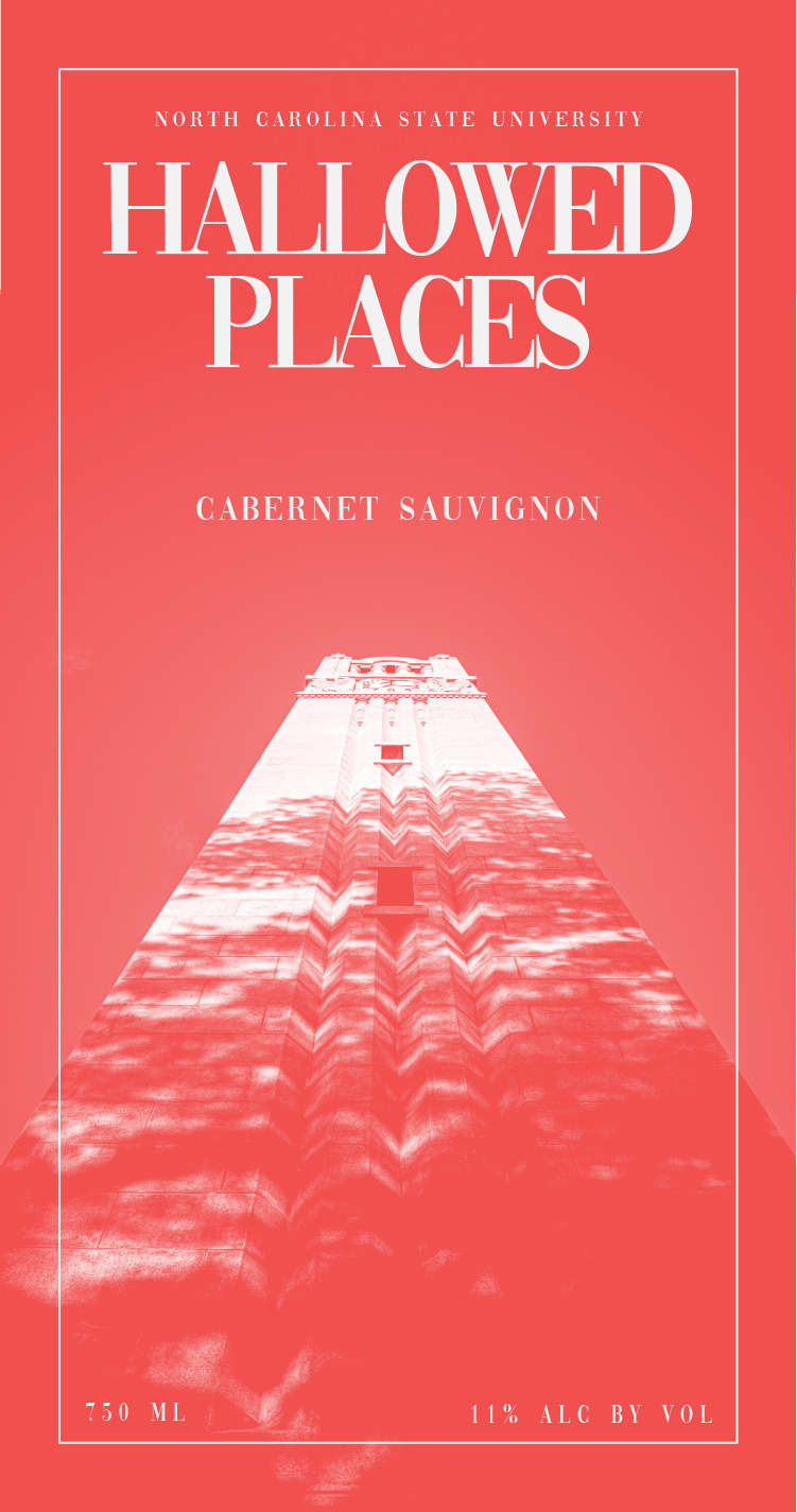
NC State Hallowed Places Collection
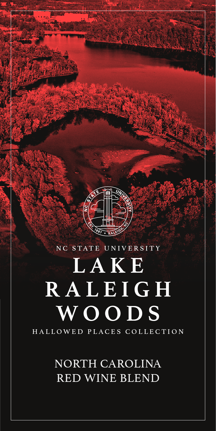
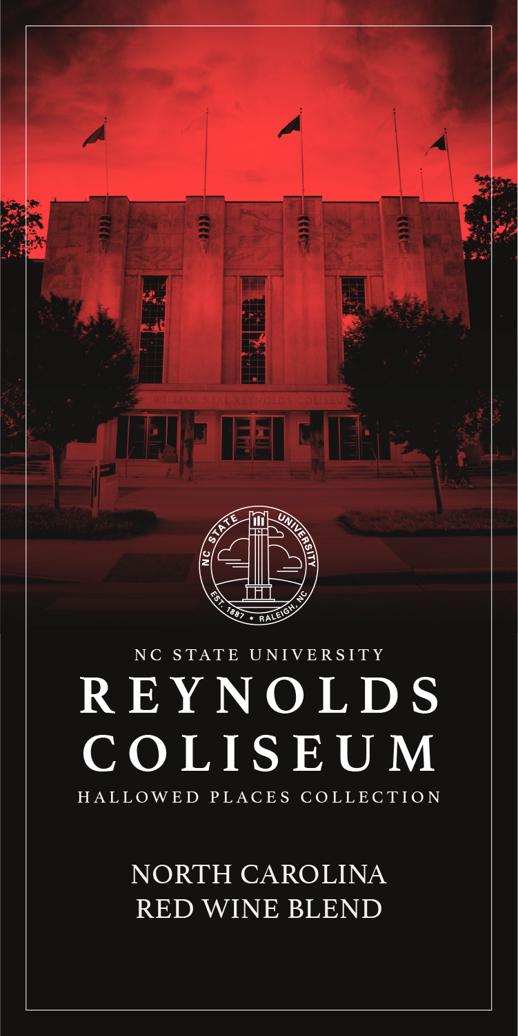
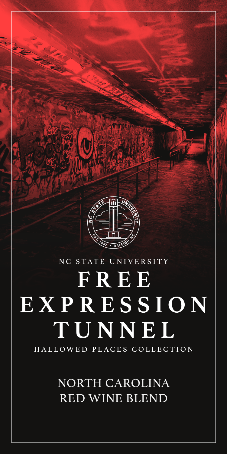
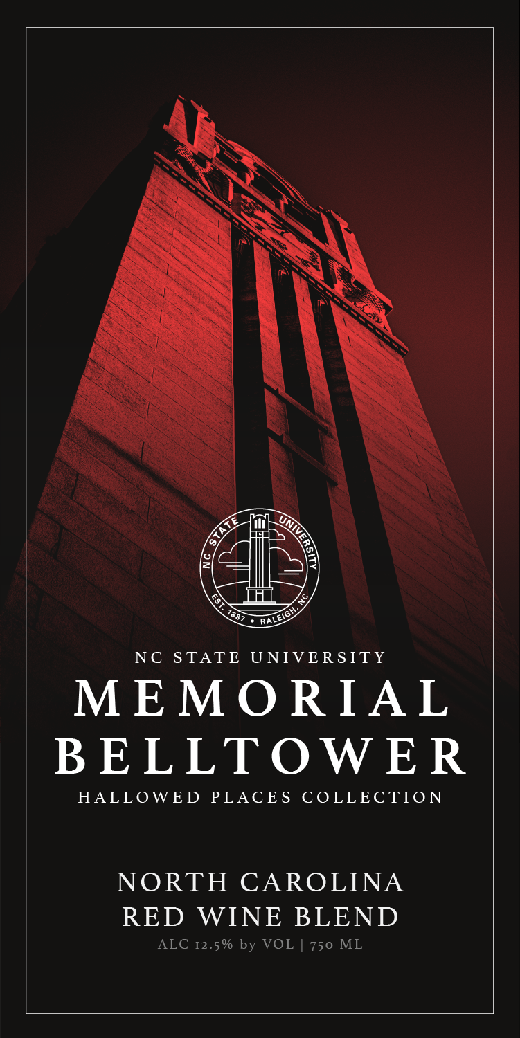
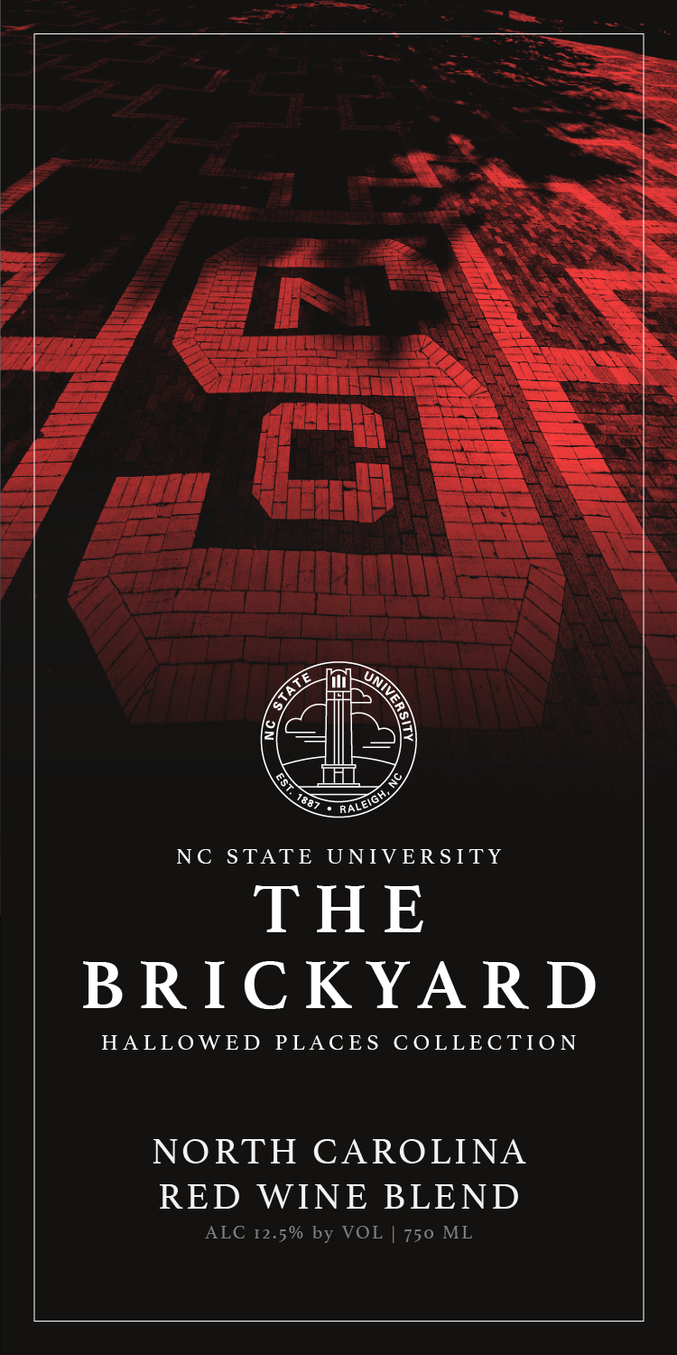
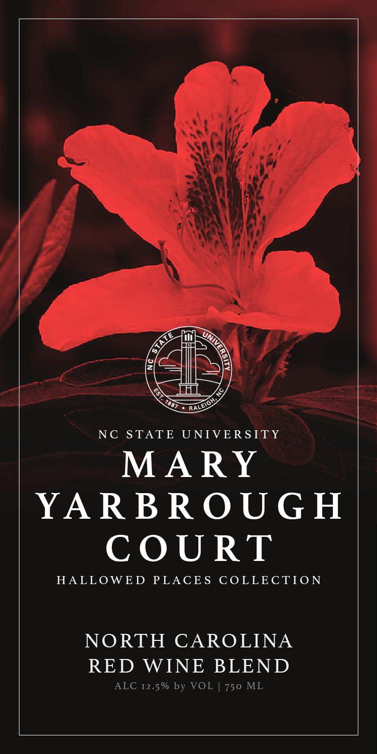
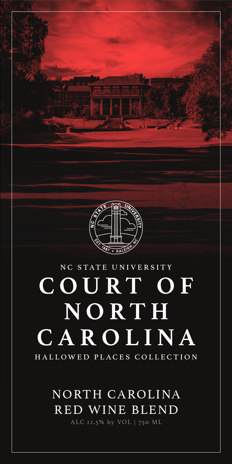
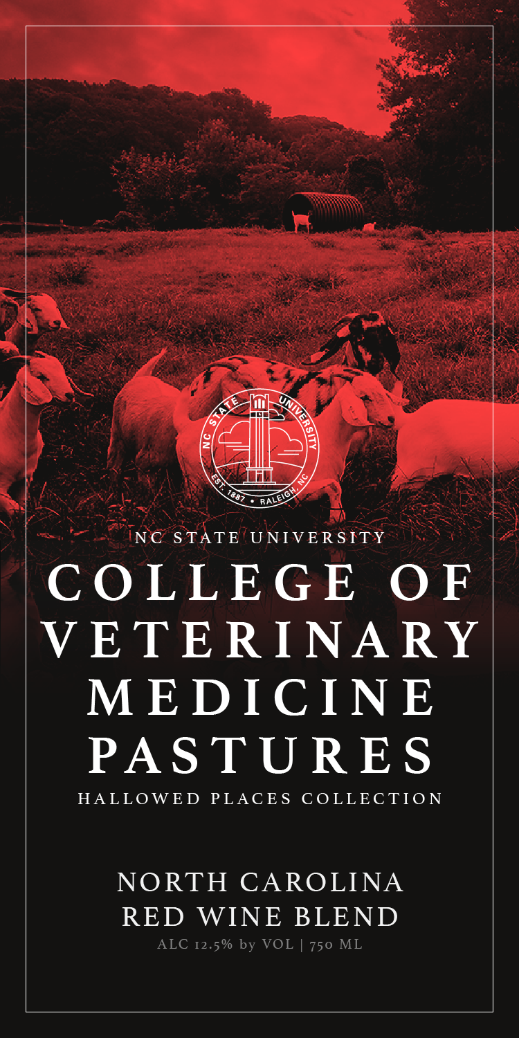
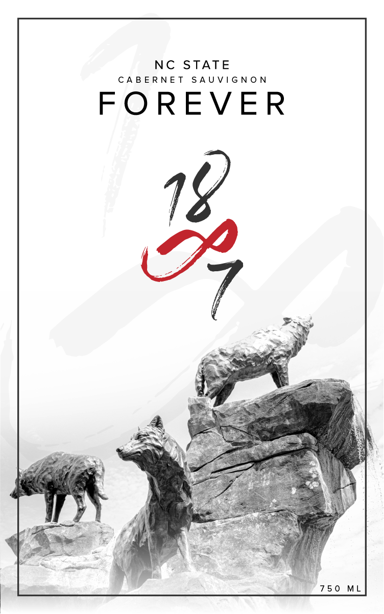
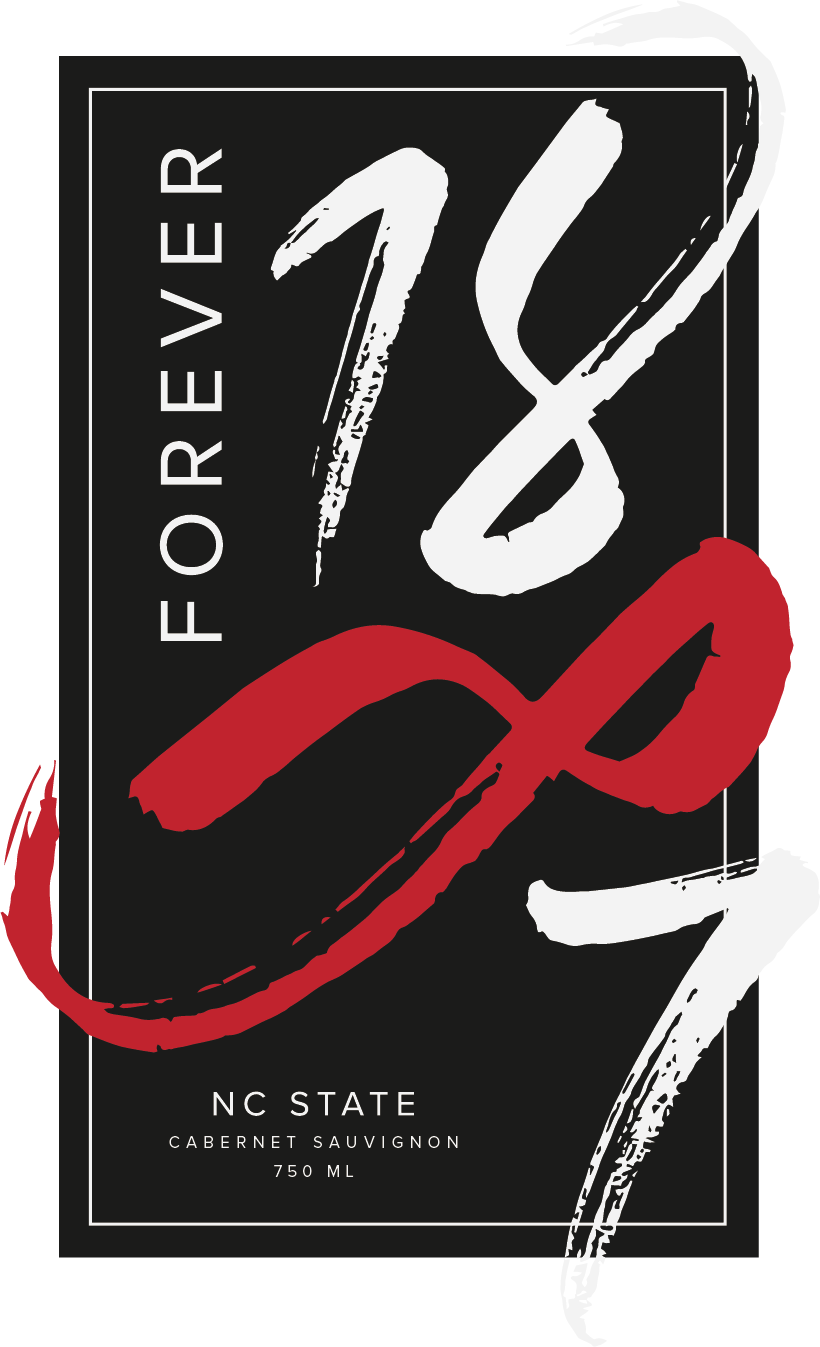
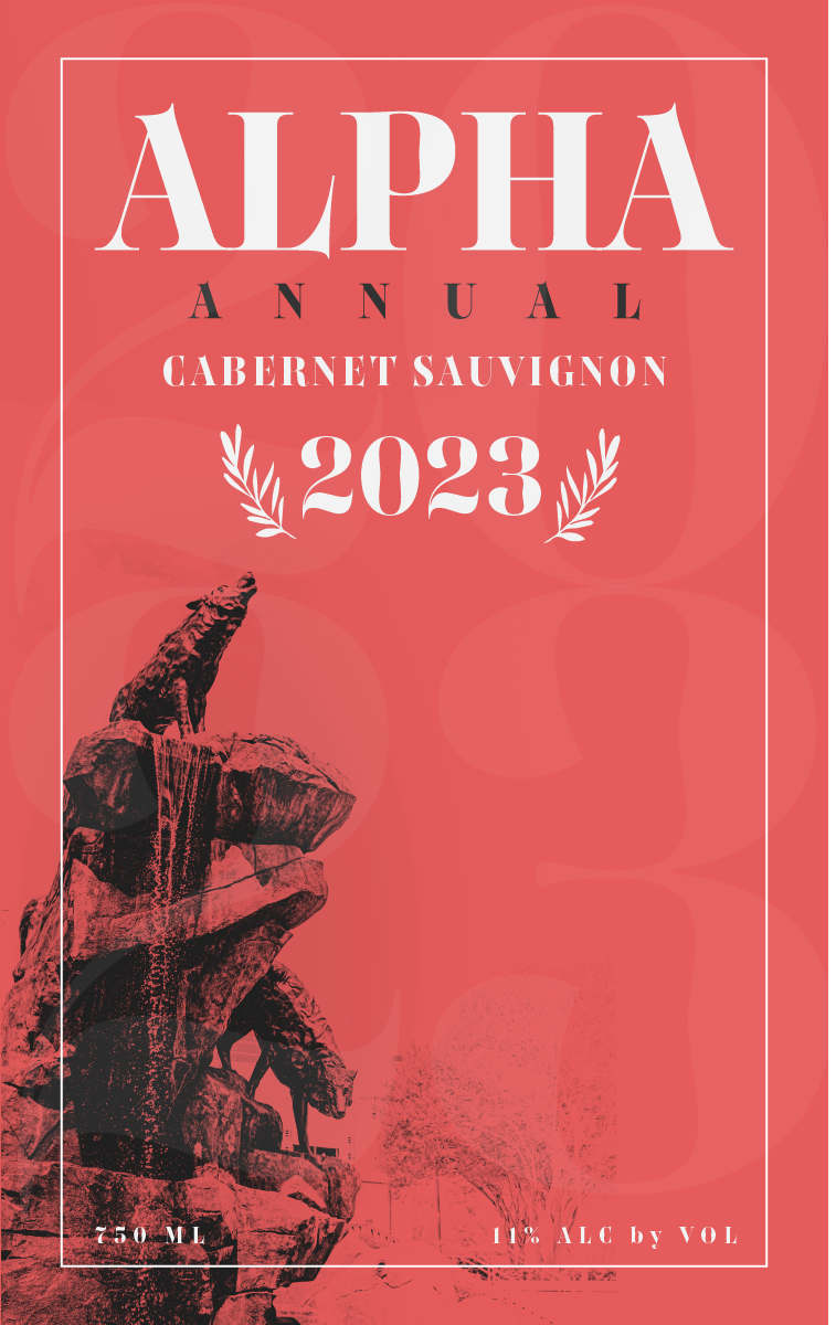
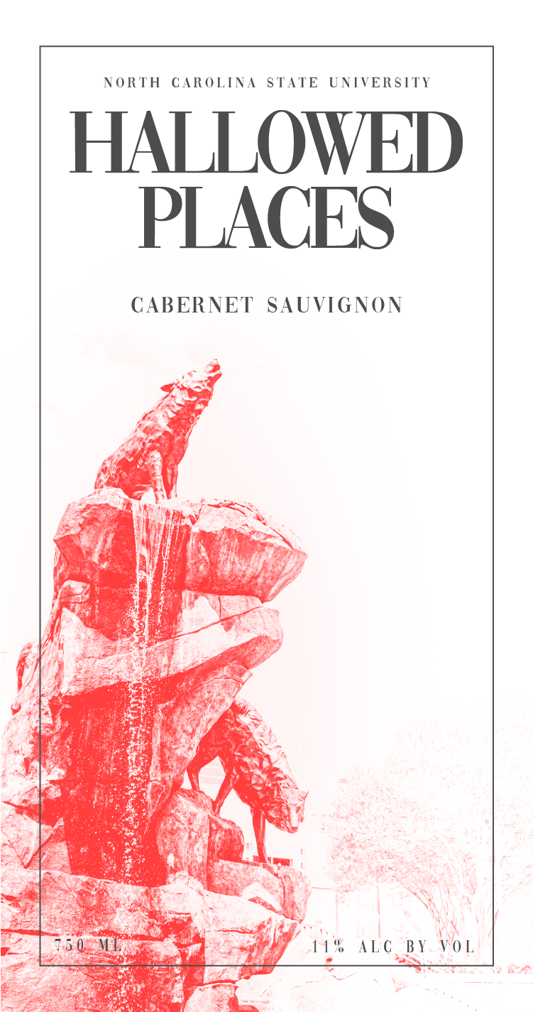
In my junior-year studio class, my classmates and I collaborated with the university to design a label for its first-ever wine bottle series, highlighting the school’s iconic locations. Partnering with Shelton Vineyards, the university, and our professor, each student developed a unique label design. After a semester of iterations and reviews, the judges selected my label to represent the series.
This experience was an incredible opportunity that fueled my passion for branding. From the start, I had a clear vision of what I wanted to achieve, and I couldn’t be prouder of the final result.
Initial Iterations and Ideas
In the early stages of the project, I envisioned a passionate NC State fan proudly displaying the entire series in an elegant setting in their home. Knowing this would be a series, I considered how each bottle would look individually—elegant and beautiful—and how they would work together side by side. This vision guided my concepts, designs, and the final product.
The result was a label design that reflects NC State's branding—elegant and visually appealing on its own, yet cohesive and striking when displayed alongside the other bottles in the series.
